
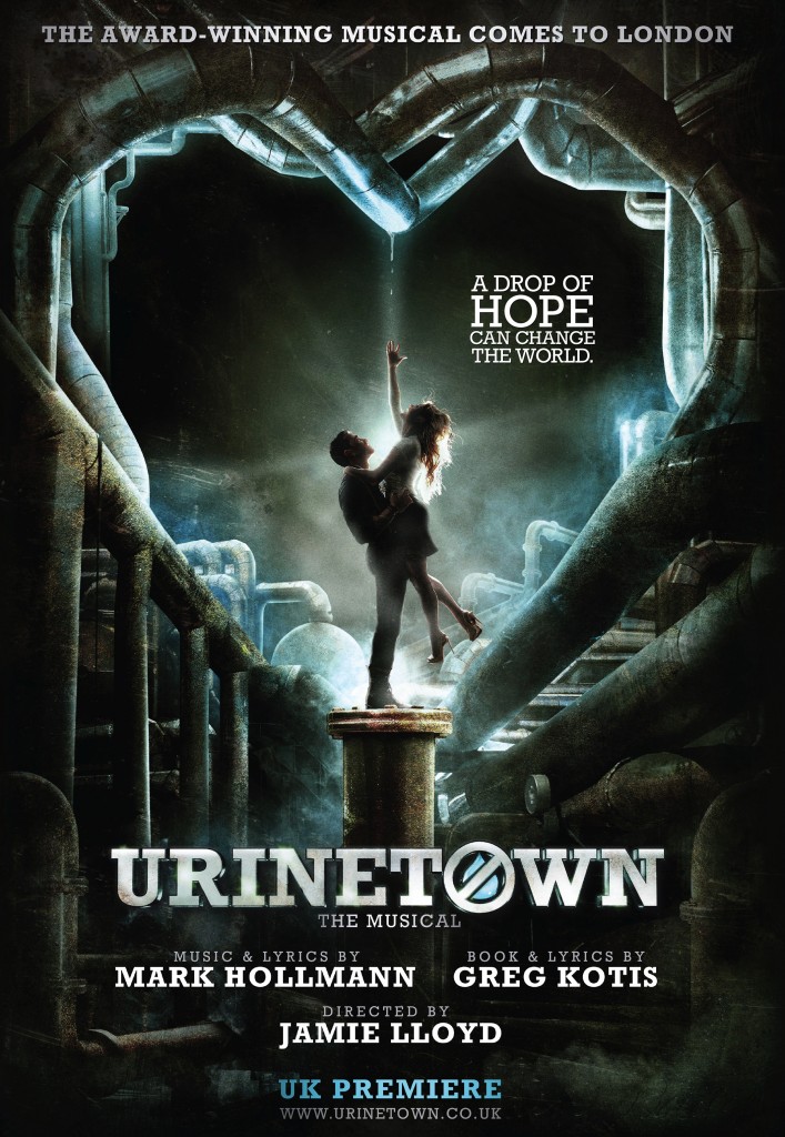
 When I saw it for the first time last week, I was really struck by the poster for the West End debut of the musical Urinetown. Why? Because it didn’t look like a theatre poster. It looked like a movie poster.
In point of fact, it looked to a certain degree like the poster for Star Trek: Into Darkness, which owed a debt to the poster for The Dark Knight Rises. Many movie posters are endlessly iterative and imitative, as they want to subtly remind you of other successful films in the same genre. I give points to Urinetown UK for evoking dark futures with humanity under threat – completely consistent with the world conjured in the show. Equally apt, it counters the darkness by placing a young attractive couple, reaching for a drop of water, at the center of a spaghetti-tangle of (empty) pipes, and they added a tagline: “A drop of hope can change the world.”
It has taken almost a decade since Urinetown’s Broadway closing for it to reach England, so the opportunity to capitalize on Broadway buzz has long since faded, That certainly suggests one reason why the graphic bears no relationship to the Broadway marketing material, unlike The Producers, The Book of Mormon, Jersey Boys and so many other US to UK transfers. That works in two directions as well, since Mamma Mia! and Matilda ads look the same in both countries, having started in London.
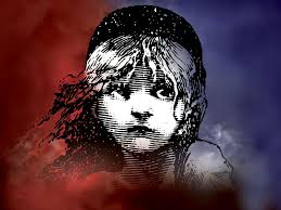 As I pondered the Urinetown UK art, it struck me that one reason the vast majority of theatre ad design looks so different from movie ad design is that while a movie is trying to simply drive sales and pique interest, theatre designs, more often than not, are trying to build a brand. If theatre images emphasize a star, they could be undermining a long run, since eventually stars leave; movies have no such problem. Think of the image of Les Mis’ Cosette: as the show ran and ran, the image became so ubiquitous that they could run ads without the show’s title and you would know what the ad was for. Producer Cameron Mackintosh’s team even could play with the image, running variations on Cosette that honored holidays or welcomed other shows to Broadway. And it was hardly the only show to do that: think of the Phantom’s mask, the eyes of Cats, the Chagall-esque Fiddler on the Roof, Larry Kert running after Carol Lawrence for West Side Story (though that would eventually be supplanted by Saul Bass’ fire escape logo for the film). Colleges, high schools and community theatres use knock-offs of these designs for years and years.
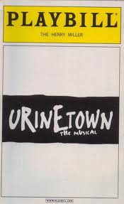 As I’ve said, it’s the lapse in time that has afforded Urinetown UK the chance to go in another direction, since given the relative age of the show, it doesn’t undermine a worldwide branding effort. The other reason they have that opportunity: in my opinion, the original Urinetown graphic never became iconic. Do you remember it? Perhaps only vaguely, and I suggest that’s because it was only a type treatment, as opposed to an image, a true logo, a brand.
To digress for a moment: when I worked at Hartford Stage, one of my responsibilities was to work with a range of local designers to secure pro bono graphic designs for each of our shows. In addition to keeping expenses down, it insured that each show would have its own feel and look, with the ads held together by a very solid, strong and consistently utilized company logo. In this process, the artistic director had only one edict – there must be some representation of the human in every graphic. He believed that people are at the center of theatre, that audiences come to watch people on stage, and so the human element – sometimes nothing more than an eye or a hand – was a reminder of the unique nature of live theatre. In hindsight, thinking back over 50 shows, I believe he was right and I’ve advocated for this approach ever since. To be fair, not every design was perfect, and some worked better as art than as marketing, but the best remain those that followed the artistic director’s dictum. If you think of great theatre graphics, I’d be willing to bet that you’ll find the majority do so as well. That’s why, at least in my estimation, there’s not a graphic image from the Broadway Urinetown that lingers in memory.
But turning back to Urinetown UK, as I have often this week, I continue to applaud the complexity and sophistication of its imagery, which come to think of it also recalls that used for Terry Gilliam’s film Brazil. I was so intrigued, that I took the time to watch a three-minute promo video for the show and, to be honest, it ended up showing me what I think is missing from the Urinetown campaign. A barrage of words flew at me from a variety of speakers, all describing the experience of the show: epic, wackadoo, eco-friendly, apocalyptic, daring, exciting, entertainment, political, adventurous and satirical wit. Director Jamie Lloyd said he hoped it would advance “conversations about climate change, environmental disaster, the moral responsibility of big business.”
But looking at the poster and watching this video, I realized that something has been, if not forgotten, downplayed for this Urinetown, at least as I know the show.
It’s very, very funny. I laughed a lot.
Not only that, it is especially funny to those who know and love musicals, since it’s “satirical wit” is focused, in part, on previous, iconic musicals.
Now if it is Lloyd’s intention to lean heavily on the show’s Brechtian overtones and downplay the humor, then you can probably ignore everything from here on in. But if Urinetown UK– with all of its topical, political and social overtones – is to retain its irreverent take on both a world without water and its stance as a love letter to musical comedy, then I’d urge the powers that be to tweak the tone of their rhetoric and their imagery, lest they mislead their potential audience – and those who buy. Remember, you’re fighting a title that, for some, carries a whiff of something distasteful, even while it becomes a memorable point of distinction from most other musical theatre.
I’ve heard it said many times that if a show is a hit, its logo – whatever it is – looks brilliant. And perhaps in the long run, if there is in the long run, that becomes a self-fulfilling prophecy. But when you’re trying to set expectations and lure audiences, every communication is freighted with meaning (it can even effect the advance perception of critics who were previously unfamiliar with the material), and what I remember most of Urinetown was having a darned good time.


